I recently red a short article on the importance of the contents page, due to its provision of an initial impression for the reader, so i was impressed with the opening page as it wasn't your typical contents page and made use of some interesting graphic design as opposed to illustration.

 These are some extracts of a specific illustrator i particularly took to. His stuff was all quite minimalistic.


 Yet another illustration i took to.
 These three scans are some of the amazing pieces of graphic design the book offered. They are all surreal pieces and remind me of some kind of outerspace supernova.

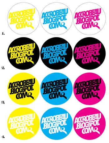
 Im becoming more and more fascinated with design in its own right as i continue to publish this blog, so excuse the deviation. I've also got some accrobeau logo and sticker designs in the pipeline so the blog will soon be blessed with a new header and a more sophisticated presentation.
 Get at me if you have the skills needed to alter / amend the appearance of the blog through use of HTML and any other computer codes that may exist.

1 comment:
nice work by ur famo . . .
Post a Comment